A slice of the pie
Here is the government spending pie using most recent official figures published by HM Treasury in Table 5.2 of the government’s annual Public Expenditure Statistical Analysis of public spending in 2013/14. These are the same numbers underpinning the HMRC tax summaries.
I’ve tried to split the spending into more meaningful headings to give an idea of where the government spends its money in a fairly simple ‘at-a-glance’ way. The stated purpose of the tax summary is after all to allow taxpayers to see how their money is spent.
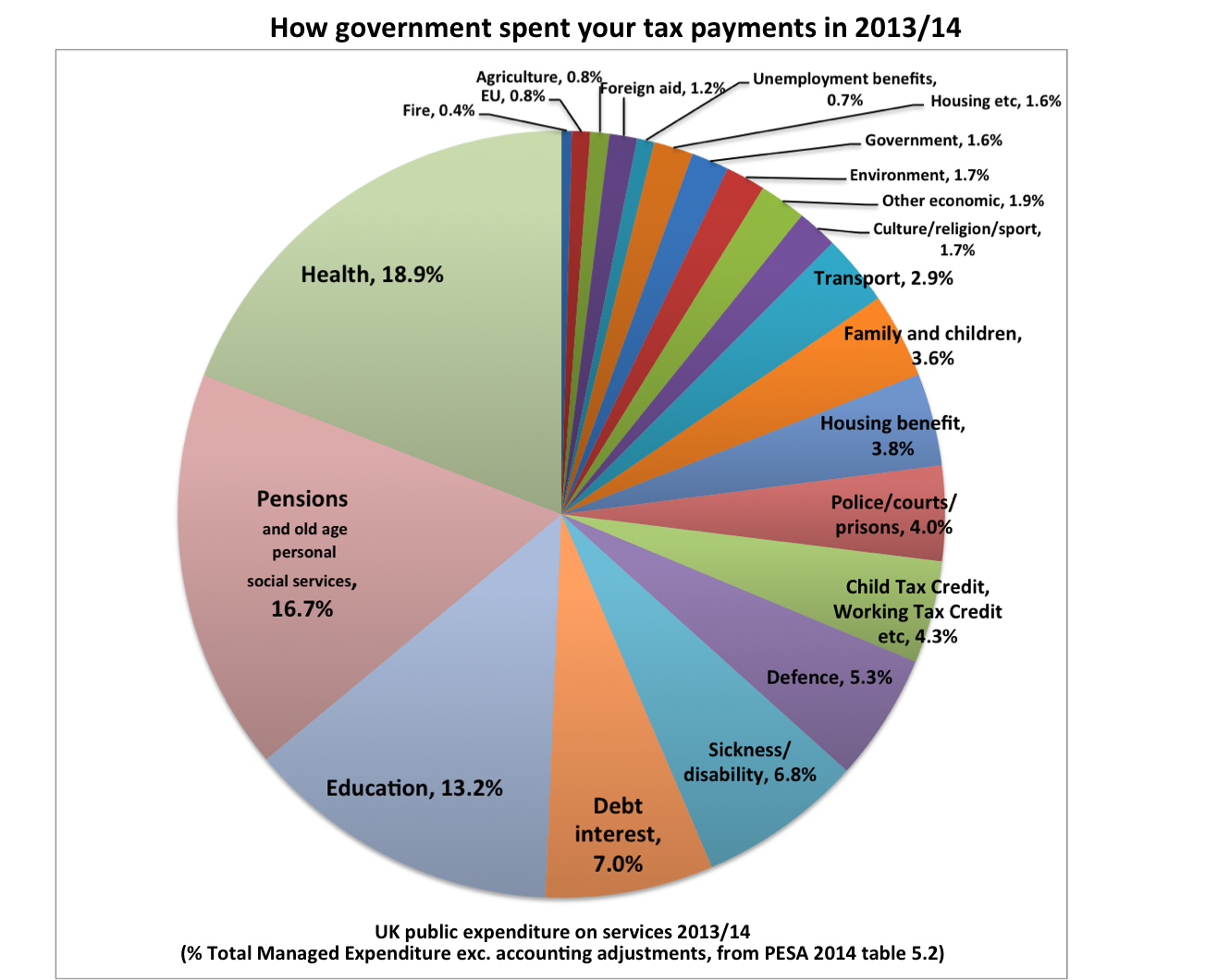
If this differs from the version you saw on Twitter (with thanks to the many who retweeted), that's because the original illustration I'd done some months ago when the tax summaries were first suggested and only 2012/13 figures were available. In view of the unsurprising interest in the issue, this one uses the now-published 2013/14 figures and some more specific headings.
Why it might not be helpful for the tax summaries to have bundled up so many different things into a single 'welfare' heading is dispassionately pointed out by the Institute for Fiscal Studies here.
And the House of Commons Library has today (4 November) also published an accessible explanation of the issues and underlying data with some more illustrations here